1
2
3
4
5
6


Church Street Cafe is located at a busy intersection between Market St and Dolores park as a great spot to post up and be productive. Available with long hours, wifi, plenty of space and Asian American food options. For my rebrand, I focused on its appeal to productive cafe workers.
For Church St Cafe's rebrand, the design is intended to communicate its best feature of being an awesome workspace. Immediate recognition that the brand is a cafe and its main theme of productivity is applied with its obvious symbolism. The logo is warm and bold, like a medium roast coffee. It is relaxing and comfortable, like a good friend's house. Its branding is meant to be complemented by slightly modern themes to remain crisp and current.
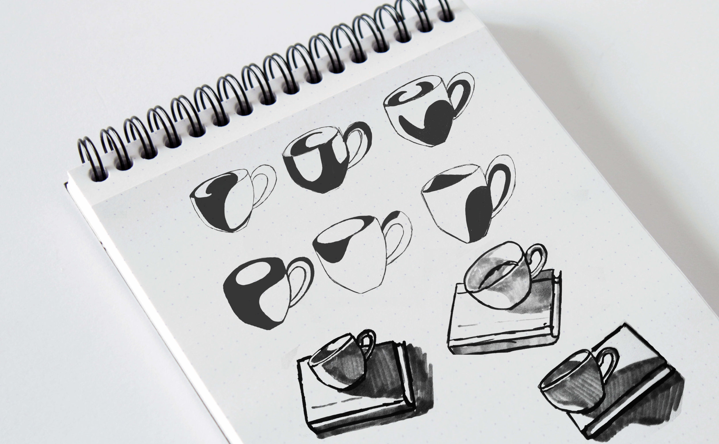
To design the logo, I used a redux drawing method. To accomplish this, I placed a mug under dramatic lighting and experimented with highlighting specific values to imitate the variations of light shapes reflected on the cup.